Media Queries are Essential to Responsive Web Design.
With CSS3 media queries, we can write CSS that delivers an optimal web experience for visitors viewing our websites at different screen sizes. CSS3 media queries also help us fine-tune our designs for our ever-expanding mobile audience. Let’s take a look at the details.

If a visitor has a web browser that supports media queries (IE9 and above), we can write CSS specifically for certain situations. For example, we can detect that a visitor has a small device like a smart phone and give them a specific layout.
We can add specific CSS for small screens or large screens (inside our cascading stylesheets). By putting our CSS media queries in the bottom of our stylesheets, we can simply overwrite any styles rules we have declared earlier in our CSS.
Media Queries in a Nutshell
- A media query is an expression that evaluates to either True or False.
- The media query syntax allows for the creation of rules.
- A media query consists of a test, followed by as many CSS rules as we want, with the rule block enclosed in a set of braces. If the test condition is false, the browser simply ignores the rule block and moves on.
- The media queries in CSS3 can be used to check for a particular condition such as the width and height (of the browser window), device width and height, orientation or resolution.
- Media queries allow for subtle or drastic changes in the appearance of a website controlled entirely within the site’s CSS.
- If our media queries come last in our CSS, they will overwrite previous CSS rules, as long as they resolve to TRUE.
- Media queries have curly braces.
Media Query Rule Example
Media Query Parts
A media query consists of 3 Parts: the Media Type, an Expression, and the Style Rules contained within the media query itself.
- The Media Type (example: screen) allows us to declare what type of of media the rules should be applied to. There are four options you can declare: all, print, screen, and speech.
- Expressions (example: (min-width: 800px) allow you to further target devices based on specific conditions you pass to the media query. Expressions test media features, which describe different features of a device, such as width and height.
- CSS Style Rules can be be listed inside the media query’s curly braces.
Colored Pencils, Pencil Boxes and Drawers
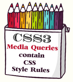
 Let’s think of Each CSS Style Rule as a colored pencil, since we often use CSS Style Rules to add color to a website. Let’s think of CSS3 Media Queries as a box that holds the colored pencils.
We can have a bunch of pencils in a box and several boxes in a drawer. Let’s think of the CSS stylesheet that holds everything as the drawer.
Of course, there may be some pencils in the drawer that are not inside the pencil boxes. So not every CSS Rule has to be in the CSS Media Queries, only the ones that are targeting specific browser widths etc..
Here’s a CSS Style Rule Example (the colored pencil):
h3 {color: red;}
We can add color to our website with the CSS Style Rule above. Here we are making all our h3 headings red. Then we can limit that color to small screens, if we like, by wrapping that style rule in a CSS Media Query.
Here’s the CSS3 Media Query (the pencil box)
with a CSS Style Rule inside (the colored pencil).
@media screen and (min-width: 800px) {
h3 {color: red;}
}
Calling Media Queries
There are two ways to call a media query: using an external stylesheet, or writing directly inside a stylesheet. The syntax of a media query is the same no matter if you use it inside a link element, after an @import instruction, or inside a CSS stylesheet.
One way to use media queries is to include them inside your single stylesheet. You can use a media query to add a breakpoint at 768px and target a computer screen.
Breakpoints
We can add breakpoints so that certain parts of our design will behave differently on each side of the breakpoint. Common breakpoints include the 320px (for smartphones), 768px (for tablets), and 1024px (for desktop monitors).
Complex Expressions
You can compose complex media queries using logical operators, including not, and, and only. You can also combine multiple media queries in a comma-separated list; if any of the media queries in the list is true, the entire media statement returns true. (This is equivalent to an or operator.)
AND (and keyword)
The AND operator is the one you’ll probably use the most. It is used for combining multiple media features together into a single media query. It requires that all conditions specified must be met before the styling rules will take effect.
Here is a media query example containing the AND operator:
(NOTE: CSS Style Rules are not included in the above example (so it actually does nothing). But they are shown in the ones below.)
Media Query Examples with CSS Rules inside (highlighted in red):
@media (min-width: 768px) {
body {
margin: 0 auto;
margin-top: 20px;
}
}
@media only screen and (min-width: 601px) and (max-width: 1200px) {
body { background: yellow; }
h3 {color: red;}
}
In the last example, the two CSS rules inside the body of the media query will only be applied if the browser window width is at or between 601 pixels and 1200 pixels.
Media Queries include “curly braces.” CSS style rules also include “curly braces,” so you will see CSS “curly braces” nested inside media query “curly braces.”

(IMPORTANT: Don’t forget to include all the curly braces. If you miss one, you may have unexpected results in the browser. Curly braces can be written on different lines, such as in the first example or made more compact, such as in the second example. Just be sure they are nested correctly inside the media query curly braces.)
In summary, basic CSS3 media queries are actually simple to learn and easy to add to cascading stylesheets to target different web devices or screen sizes. They just take a little practice.
To learn more about CSS Style Rules, see Smooth Strides from CSS to CSS3.
To learn more about CSS Media Queries and test your own examples, see What are CSS Media Queries?

Return to Top