Are you a small business owner thinking about updating your website? Then you should consider utilizing Responsive Web Design.
Responsive Web Design is one of those hot web design topics right now. It is a web design approach used to provide an optimal viewing experience across a wide range of devices – from a desktop computer to a cell phone.
A Responsive Website automatically changes to fit the device you’re reading it on. If you’re reading this blog post on a desktop computer, you can see it in action. Simply adjust the size of your web browser. You will see that the layout adapts to the new width of the browser.
Having a website that adjusts its content automatically will likely enhance your visitors’ experience. You don’t want mobile device users to have to pinch, zoom and scroll just to find out if they’ve come to the right place.
Responsive Websites in New Hampshire
Right now, it seems that responsive websites are still few and far between in New Hampshire so you still have plenty of time to decide if it is right for your business.
Here are some examples:
In the examples below, you can see how the headers of the websites spread out to fill the space provided in wide browsers (such as on desktop computers).
Here’s how the top sections of the same three websites look when the browser space is reduced (such as on mobile phones):
Each website becomes a long slim one where the visitor scrolls down to see the rest of the content. (Scrolling up and down is much easier for the mobile visitor than pinching and zooming.) You can expect websites designed this way to become more and more popular, especially since more people are accessing the internet from their mobile devices than from their desktops now.
Pros and Cons of Responsive Web Design
One of the main advantages of Responsive Web Design is that business owners no longer need to create a separate mobile website. Having one business website with a flexible layout is easier and less expensive to maintain.
One of the disadvantages of Responsive Web Design is that it is a bit more complex and time-consuming to initially design. Also, the website load time is increased slightly because this kind of programming generally requires more code.
Responsive Web Design Navigation
Navigation is probably the trickiest aspect to responsive design since mobile users don’t have a clickable mouse to pinpoint tiny links. They must point to areas on the screen with their fingers or thumbs, which are much less precise.
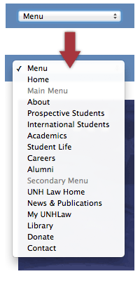
Responsive Web Designers usually try to make navigation easier for mobile users by adding more space around menu links, or by replacing the links with buttons. You will also notice that Responsive Web Designers often change the navigation menu to a drop down menu for their mobile visitors (to accommodate other content on the screen). Mobile visitors can reveal the full menu by tapping on it with a finger.
UNH School of Law Website Navigation Example

In the above example from the UNH School of Law website, the links on the far right of the navigation bar floated under the top row (creating two rows) when the size of the browser was reduced.

In the example on the right, the navigation bar has changed into a drop down menu (for mobile phone users).
These visitors can tap on the menu to see the list of links.
As you can see, web designers and business owners alike have noticed that consumers are now using their cell phones for much more than talking. They are moving toward mobile devices to access the internet and make purchases.
See What You Need to Know About Mobile Internet Users and Their Shopping Behavior to learn more.
If you are still unsure about whether a responsive website can make your website visitor’s experience more enjoyable and productive, grab an iPad or a cell phone and explore some of the responsive websites mentioned in this blog post. Then visit your own website and compare. You may discover that responsive web design makes perfect sense for your next website.


Return to Top
6 comments
The best advice is as you have mentioned here… If you dont think responsive is worth it then visit a website that isn’t responsive on a mobile device and then one that is responsive. It’s worlds apart!
Excellent suggestion! Thanks for sharing your ideas.
Good informative read and also a nice suggestion.
I’m glad to see more and more small businesses utilizing responsive web design. With so many people using their mobile devices to access the Internet, it’s critical that every business’ website be optimized for mobile devices. And the costs to upgrade a website design to responsive isn’t much when compared to the potential losses by not having one. –David
Hi Em, I like the way you explain the things responsive web design. I really loved reading your blog. It was very well authored and easy to understand about responsive web design.
Nice simple explanation about the benefits of responsive design. In today’s mobile world where most of us and our customers are accessing the Internet with our smartphones and tablets, it’s critical that websites be mobile friendly. And although there are a few exceptions, for most websites, responsive design is probably the best way to address that need. –David @ Touch Point Digital